Most people who works with vSphere already knows the vCenter Performance Graphs. What most people don’t know is the “Metric Chart” in vCenter Operations Manager. In this article I want to discuss pros and cons of vCenter Performance Graphs vs. vCenter Operations Manager Metric Charts.
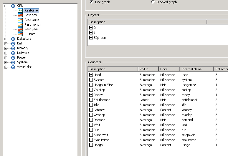
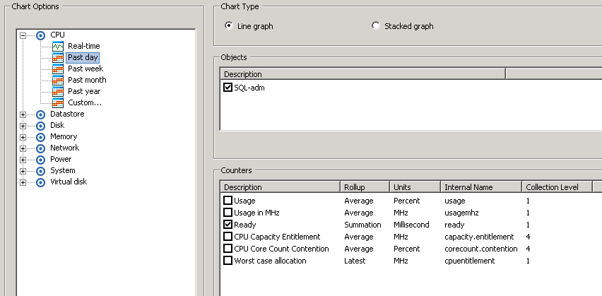
The Performance Graphs in vCenter can show information about the following CPU, Datastore, Disk, Memory, Network, Power, System, Virtual disk. You can the select if you want the graph to show: Real-time, Past day, Past week, Past month, past year or Custom.
When looking at these graphs the following table sums up what you are seeing.
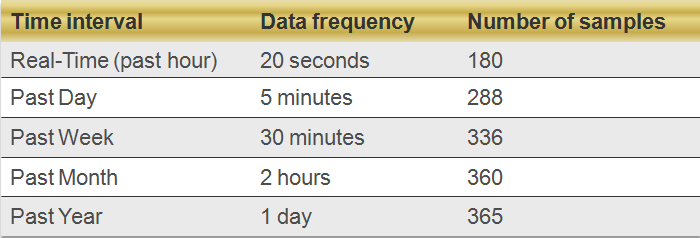
So by looking at the Real-Time graph you actually looks at a graph that is updated by a frequency of 20 seconds. So 180 datapoints in just one hour. But when you look at Past Day your graph is updated every 5 minutes. This is where rollup occurs. Without rollup you vCenter database would grow a lot in size. Whatever data you look at in the Past Day the graph is updated in 5 minutes interval, but what happens if you look at the graph more than 24 hours ago? Well if it is in the past week your graph will be updated every 30 minutes, but if you are further back your graph is updated every 2 hours! This basicly tells us that vCenter Performance Charts is BEST in Real-Time, it is alright in Past Day but moving further back than 24 hour data is being rolled up and we loose valuable insight. Look at the following screenshots to see what happens:
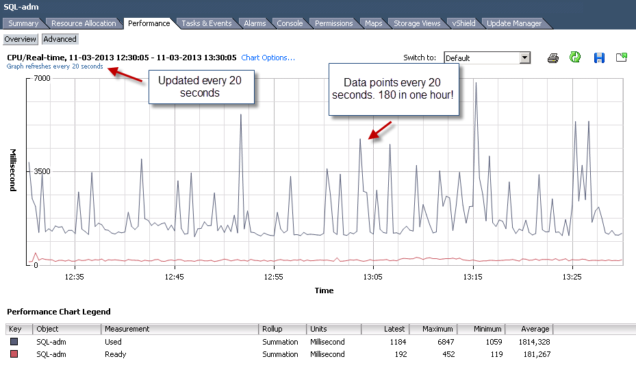

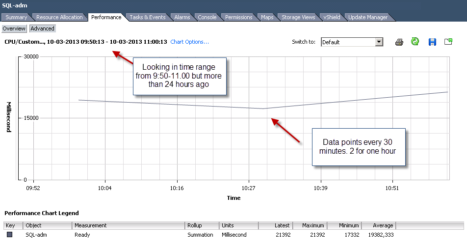
You should have noticed how we lose information when we try to investigate performance back in time. The further back we go the more we lose. Not only does data points get rolled up. But try and go back to the first graph. On the first graph we had the counters “Ready” and “Used” but on the other two we only have “Ready”. No I did not remove it. This is another feature of vCenter. Not only does it roll up. But it also chooses to remove counters as soon as we are looking at data more than one hour ago.
Now you should know some of the limitation with vCenter. So what is the solution if you want to look at data that is 1) More than one hour ago or 2) more than one day ago. The answer is of course vCenter Operations Managers Metric Charts. vCenter Operations Manager collects every counter and does not remove them when looking back. And vCenter Operations Manager have data points every 5 minutes. So yes you can argue that the past hour graph in vCenter is better than vCenter Operations Manager! That is true. The only time you actually should use vCenter Performance Graphs is when looking at the “Real-Time” graph.
Lets take a look in vCenter Operations Manager:
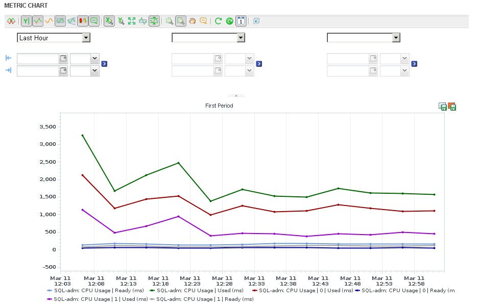
The graph is for the “Last Hour” but I can dive into any period and see all counters updated every 5 minutes. Maybe it is monday morning now and we have a reported performance problem that happened this saturday between 2am and 3am. Well just change the graph to that interval. Data is there, and you have EVERY counter.
Leave a Reply